Business strategy The difficulty of futures thinking So many organisations simply cannot see what the future is doing to the present.
The Future of Work What does work look like if it is meaningful for people? For fun people will choose to push themselves to finish a marathon, for work - we're forced to sit still, stare at a screen and move things around with a mouse.
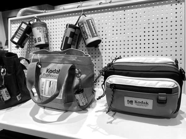
Brand strategy Could Kodak still access a different future? The future trajectory of the brand seems like a destiny, but we can't help but wonder if Kodak still has access to a different future.
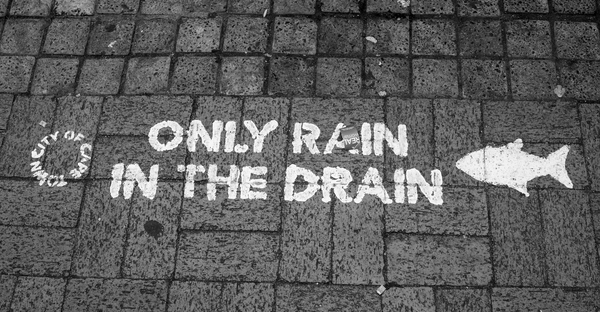
Complexity Only rain in the drain We can almost already hear old CapeTalker's phoning into John Maytham's afternoon show.
The New World of Business Business futures in the era of AI? What futures are in play for business facing the uncertainty created by AI?
The New World of Business Predators spend most of their lives waiting This 'quietly waiting for long-periods' coupled with brief moments of 'fast, intense, directed action' is the strategy that makes predators top of the food chain.
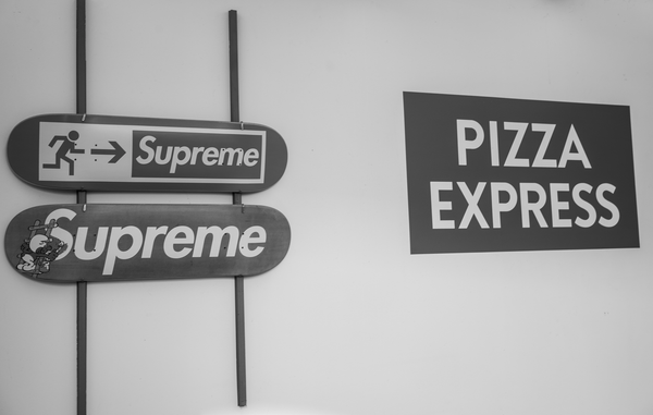
The Future of Marketing and Branding Supreme inside a PIZZA EXPRESS The loose brand collaboration was grimy and entirely perfect.
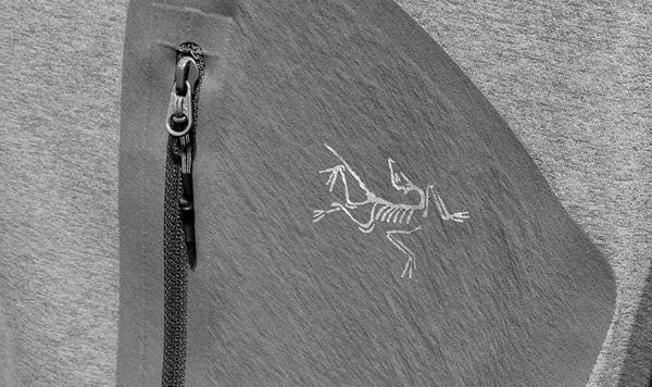
The Future of Marketing and Branding Arc'teryx explores suffering and intense pain as a brand hook We yearn for the feeling of being lost on a mountain.
The New World of Business Helinox is the world's lightest outdoor gear What Helinox is, and strives to become even better at, is 'ultra lightweight outdoor gear'. And on so many levels, this incredibly simple idea is genius.
Marketing strategy The bookstores of Seoul are enough to make a visit worthwhile South Korea takes eduction incredibly seriously.
Horizon scanning The emergence of a deeper level of brand building How world beating brands are being built is changing quite significantly.
Business strategy Saving the bottom line at the expense of reputation In South Africa (in particular), the country is very sensitive to any corporate behaviour that seemingly puts entrepreneurs or jobs at risk.
Business strategy Sources of motivation If you want to strategically change the future of an organisation its not enough to just know why the change is important.
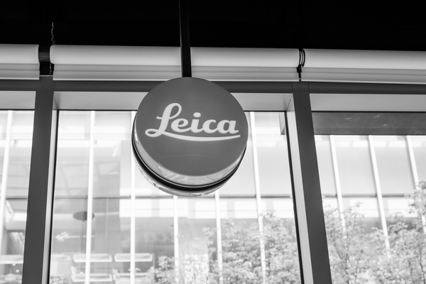
The Future of Marketing and Branding It's tough to pin down exactly what makes a Leica so alluring Leica offer something quite unique; a different experience of the world. A slowing down. Moments that are worth holding onto.
Business strategy Forecasting vs. foresight Steering a business with any kind of aspiration for future success without foresight in these times of global upheaval is not advisable.
Marketing strategy Listening to records in Mullae-dong, Seoul There are places where you can rent and enjoy an old-school Sony Walkman and tape decks are still revered as 'cool technology'.
Brand strategy MUJI is the world through the lens of design With more than 1400 stores around the world, the brand is performing very well and can be considered to still be at a pre-growth phase of its evolution.
Business strategy Elements of a good growth strategy Marketing, innovation, brand building and constant, structured program of R&D are the corner stones.
Business strategy UNIQLO gets it all right Brands that outperform their peers demonstrate a core reverence to a unique and inspirational mental framework that drives growth and success.
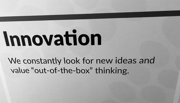
Innovation What kind of mindset is required for innovation? If category competitors want to feel extra miserable about their increasingly distant position in the category, our suggestion would be for them to just watch this video on repeat.
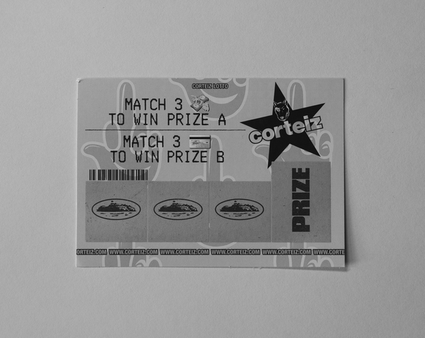
Marketing strategy Free prize inside Stickers are a seriously underutilised tactic, as are scratch cards.
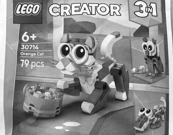
Brand strategy How LEGO is delivering outperformance A serious focus on top line growth is paying handsome dividends.
Brand strategy These are South Africa's biggest brands 2026 Will this be the last year that MTN is the most valuable South African brand?